The Montserrat font, with its clean geometric lines and modern aesthetic, has become a popular choice for designers and brands worldwide. This versatile sans-serif typeface, inspired by the typography found in the historical Buenos Aires neighborhood of Montserrat, adds a touch of urban sophistication to any project.
What Makes Montserrat Font So Popular?
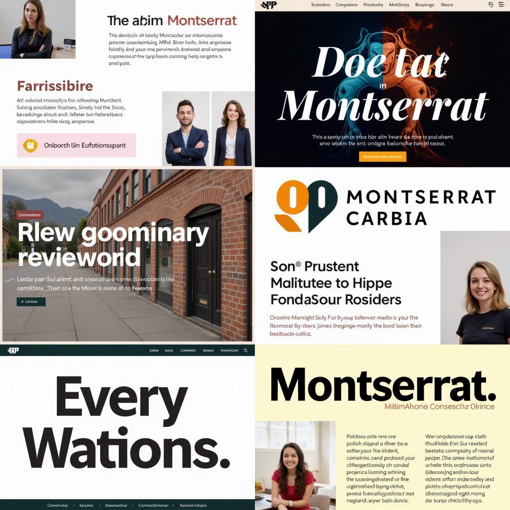 Montserrat Font Examples
The Montserrat font’s popularity stems from its unique blend of geometric simplicity and friendly readability. Its clean lines and well-defined letterforms make it incredibly legible, even at small sizes. This makes it an excellent choice for both digital and print media, from websites and mobile apps to brochures and signage.
Here are some key features that contribute to its widespread appeal:
- Geometric Structure: Its geometric foundation gives it a modern and minimalist feel, aligning with current design trends.
- Excellent Legibility: The clear and distinct letterforms ensure readability across various sizes and mediums.
- Versatility: Its clean aesthetic lends itself to a wide range of design projects, from corporate branding to creative projects.
- Open Source: Its availability as an open-source font makes it accessible to designers and users without licensing fees.
The History of Montserrat Font
The Montserrat font was created by Julieta Ulanovsky, an Argentinian graphic designer, who drew inspiration from the signage and typography found in the traditional Montserrat neighborhood of Buenos Aires. The neighborhood, with its rich history dating back to the early 20th century, featured a unique style of hand-painted signs, often using geometric sans-serif typefaces.
Ulanovsky, noticing the disappearing beauty of this urban typography as modernization took over, embarked on a project to preserve its essence. She digitized and refined the letterforms, creating the Montserrat font as a tribute to the neighborhood’s visual heritage.
Exploring the Montserrat Font Family
The Montserrat font family offers a range of weights and styles to suit different design needs. Understanding the nuances of each variation can help you maximize its potential in your projects.
- Montserrat Regular: This is the standard version of the font, offering a balanced blend of readability and visual impact.
- Montserrat Alternates: This style introduces subtle variations in certain letterforms, adding a touch of uniqueness to the design.
- Montserrat Subrayada: This variation features distinctive underlines inspired by traditional signage, adding a touch of vintage charm.
- Montserrat Thin: This lightweight option works well for headlines and titles, offering a delicate and elegant aesthetic.
- Montserrat Black: This boldest variation commands attention and is ideal for impactful headlines and short bursts of text.
How to Download and Use Montserrat Font
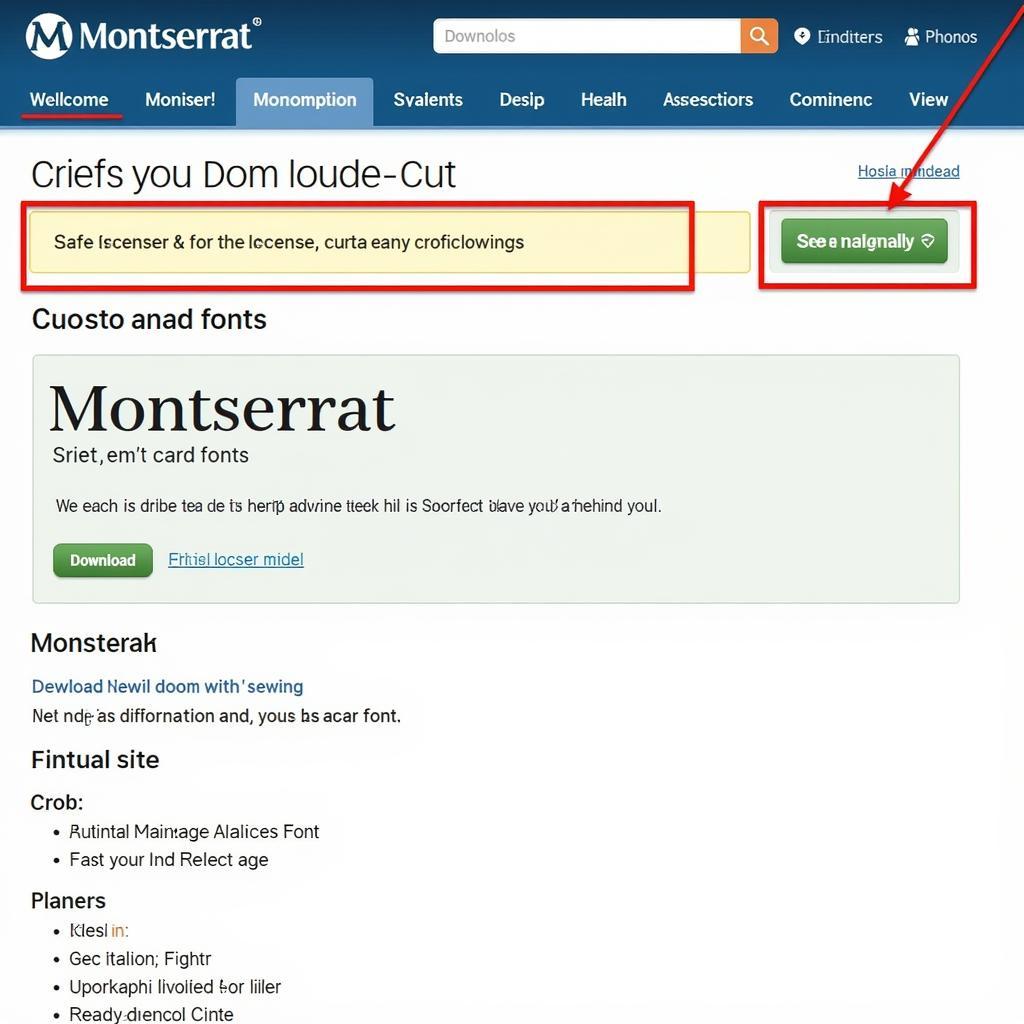 Montserrat Font Download Website
Downloading and using the Montserrat font is a straightforward process:
- Find a Reputable Source: Numerous websites offer free font downloads, but it’s crucial to choose a reputable source to ensure the font file is safe and authentic. Google Fonts is an excellent option for downloading Montserrat.
- Select the Font Weights: Download the specific font weights you need for your project. You can choose from a variety of options, including regular, bold, light, and more.
- Install the Font: Once downloaded, double-click the font file and follow the on-screen instructions to install it on your computer.
- Use in Design Software: Open your preferred design software (Adobe Photoshop, Illustrator, etc.) and select Montserrat from the font menu. You can now start using this versatile typeface in your designs.
Tips for Using Montserrat Font Effectively
- Pair It Wisely: Montserrat works well with a variety of other fonts, but pairing it with a contrasting typeface can create a visually appealing dynamic. Consider pairing it with a serif font like Playfair Display or a script font like Pacifico for an elegant contrast.
- Utilize White Space: Given its geometric structure, Montserrat benefits from ample white space. Ensure sufficient spacing between letters, words, and lines for optimal readability and visual appeal.
- Experiment with Weights: Don’t be afraid to play around with different Montserrat font weights to create visual hierarchy and emphasis. Use bolder weights for headings and thinner weights for body text.
- Consider the Context: While Montserrat is versatile, its suitability depends on the specific project. Ensure the font’s style aligns with the overall tone and message of your design.
Conclusion
The Montserrat font, with its geometric elegance, excellent readability, and open-source availability, has earned its place as a go-to typeface for designers across various disciplines. From branding and marketing materials to websites and mobile apps, its versatility allows it to enhance a wide range of projects. By understanding its history, exploring its variations, and following best practices for its use, you can harness the power of this captivating font to elevate your designs.
Need Assistance? Contact us at Phone Number: 0966819687, Email: squidgames@gmail.com Or visit us at 435 Quang Trung, Uông Bí, Quảng Ninh 20000, Vietnam. Our customer support team is available 24/7.