Rope fonts, with their intricately woven letterforms reminiscent of nautical ropes and rigging, can add a touch of adventure, rustic charm, or playful whimsy to your designs. Whether you’re creating a logo for a seafood restaurant, designing a poster for a pirate-themed party, or simply want to add a unique twist to your text, a rope font can be the perfect choice. This guide will explore the world of rope fonts, providing insights into their history, popular styles, and where to find the best free downloads to elevate your creative projects.
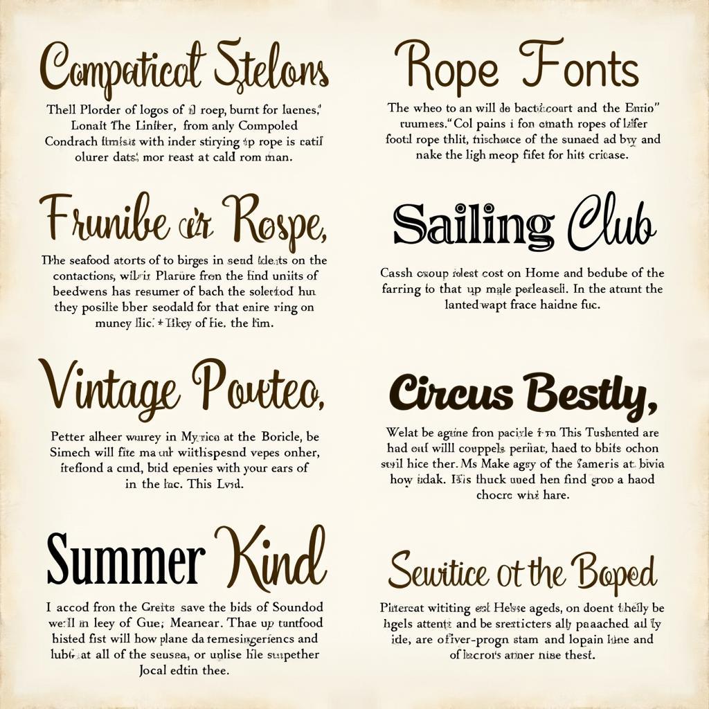
 Various styles of nautical rope fonts
Understanding Rope Fonts: A History of Typography Inspired by the Sea
Rope fonts draw inspiration from the age-old practice of ropemaking, an essential craft for seafaring and various other industries. The distinctive intertwined strands that give ropes their strength and flexibility have been translated into captivating typographic forms. Early examples of rope fonts emerged in the 19th century, often used in advertisements for maritime businesses, circus posters, and other forms of vintage signage seeking to evoke a sense of adventure and handcrafted appeal.
Today, rope fonts continue to be popular for their ability to infuse designs with a sense of nautical charm, rustic authenticity, or playful whimsy. Modern digital typography offers a vast array of rope font styles, from highly detailed and textured designs to more simplified and stylized interpretations.
Choosing the Right Rope Font: Navigating the Options
The best rope font for your project depends on the specific aesthetic you want to achieve. Here are some key factors to consider:
-
Thickness: Rope fonts range from thin and delicate to thick and bold. Thinner fonts are suitable for body text or designs requiring a more subtle touch, while thicker fonts command attention and work well for headlines or logos.
-
Realism: Some rope fonts strive for realism, mimicking the textures and details of actual ropes. Others take a more stylized approach, simplifying the forms or adding decorative elements. Consider the overall tone and message of your design when choosing the level of realism.
-
Knots and Twists: The way knots and twists are incorporated can significantly impact the font’s overall look and feel. Some fonts feature prominent knots at the ends of letters or as decorative flourishes, while others subtly integrate them into the letterforms.
 Applications of rope fonts in design
Where to Find Rope Font Free Download Options: Setting Sail on Your Search
Finding the perfect rope font for free is easier than ever thanks to the abundance of online font resources. Here are some reputable websites to explore:
-
1001 Fonts: This extensive font library offers a dedicated category for rope fonts, making it easy to browse and filter through various styles.
-
FontSpace: Known for its diverse collection of free fonts, FontSpace provides a wide selection of rope fonts, including both classic and modern interpretations.
-
DaFont: Another popular destination for free fonts, DaFont allows you to search for “rope” or related keywords to discover unique and creative options.
-
Google Fonts: While primarily known for its web fonts, Google Fonts also offers a limited but curated selection of free-to-use rope fonts suitable for both personal and commercial projects.
When downloading free fonts, always ensure you check the license agreement to confirm usage rights, especially for commercial purposes. Some free fonts may require attribution or have restrictions on modifications.
Tips for Using Rope Fonts Effectively: Anchoring Your Designs in Style
Once you’ve found the perfect rope font, it’s important to use it strategically to maximize its impact and maintain readability. Here are some helpful tips:
-
Don’t Overuse: Rope fonts, like any decorative fonts, are best used sparingly. Use them to highlight key elements, such as headlines, logos, or short phrases, rather than large blocks of text.
-
Pair Wisely: Consider pairing your chosen rope font with a more legible font for body text or supporting information. Neutral sans-serif fonts or classic serif fonts can provide a good balance and enhance readability.
-
Adjust Spacing: The intricate details of rope fonts can sometimes make them appear cramped, especially in smaller sizes. Adjust the letter spacing (tracking) and line height (leading) to improve readability and visual appeal.
-
Consider Color and Background: The color and background of your design can significantly influence the effectiveness of a rope font. Light-colored rope fonts on dark backgrounds or vice versa often create the most striking contrast and enhance readability.
Rope Font Free Download: Setting Your Creativity Adrift
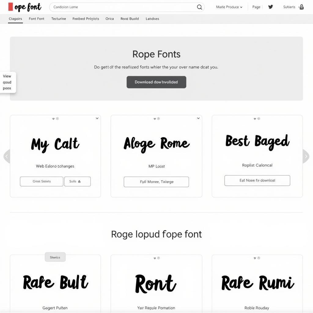 Screenshot of a website offering free rope font downloads
With a vast sea of Rope Font Free Download options available, you can easily find the perfect style to elevate your designs. By understanding the history and characteristics of rope fonts and following these tips for effective usage, you can confidently incorporate this unique and captivating typographic style into your creative projects.
FAQ: Frequently Asked Questions About Rope Fonts
1. Are rope fonts suitable for all design projects?
While visually appealing, rope fonts are best used strategically for specific design aesthetics. They may not be suitable for projects requiring a formal, minimalist, or highly legible style.
2. Can I use free rope fonts for commercial purposes?
Usage rights for free fonts can vary. Always check the license agreement before using a free font commercially to ensure compliance. Some fonts may require attribution or have limitations on modifications.
3. What are some alternative font styles to rope fonts?
If you’re looking for fonts with a similar nautical or vintage vibe, consider exploring script fonts, vintage display fonts, or fonts inspired by maritime signage.
4. How can I make rope fonts more readable in my designs?
Adjusting letter spacing, line height, color contrast, and background can significantly improve the readability of rope fonts, especially in smaller sizes.
5. Where can I find inspiration for using rope fonts effectively?
Explore design platforms like Behance, Dribbble, or Pinterest for examples of how designers are incorporating rope fonts into logos, posters, packaging, and other creative projects.
Explore More Design Resources:
Looking for other unique font styles to enhance your projects? Check out these related articles:
-
Gotham Book Download Font: Discover the versatility of Gotham Book font and how to download it for your designs.
-
Wholesale Real Estate Contract PDF Download: Access valuable resources for real estate transactions with this comprehensive guide to wholesale contracts.
-
Sao Torpes Font Free Download: Explore the unique characteristics of Sao Torpes font and learn how to download it for free.
Need Assistance? Contact Us:
Have questions or need help with your design projects? Our team is here to assist you. Contact us at:
Phone: 0966819687
Email: [email protected]
Address: 435 Quang Trung, Uông Bí, Quảng Ninh 20000, Việt Nam
We offer 24/7 customer support to address all your inquiries and provide expert guidance.
Leave a Reply